Global and European Dashboards Mapping the Spread of COVID-19
COVID-19-dedicated dashboards, based on open data, help to visualise global and regional COVID-19 data by using interactive maps and news sections.
COVID-19 dashboards
With COVID-19 currently spreading rapidly across the globe, every citizen, specialist and policy maker wants to have reliable and understandable information at her/his fingertips. Many countries in and outside Europe have created dashboards displaying relevant data, such as the number of confirmed cases, of recovered and deceased patients, in a multitude of ways (e.g. graphs, tables or maps) and updated regularly.
These dashboards are valuable to anyone who has an interest in understanding and analysing the data describing the development of the pandemic. Health institutions can make data-driven decisions and afterwards track the effect of the measures on the number of confirmed cases and deceased. Thus, the dashboards provide all citizens with very useful information to stay up to date and be aware of the situation. The choice of dashboards as a tool is especially helpful to users who may be data-literate but do not have the skills to process and visualise the data themselves. By illustrating the data in interactive and insightful visualisations that can be customised to best address the needs of the user, everyone can build for themselves an understanding of the status quo, including those who are uncomfortable dealing with the underlying data directly.
Many dashboards have been created. Prime examples are the dashboards created by the World Health Organisation (WHO) and by Johns Hopkins University (JHU) The latter is often used as source for other dashboards, since they provide a frequently updated repository including the latest numbers. Similarly, the dashboard created by the European Centre for Disease Prevention and Control (ECDC) includes both global and European data. The ECDC’s data is also used to develop another dashboard by one of the EDP for COVID-19 partners, which provides several features in addition to the ECDC’s own dashboard, such as the day-on-day difference in terms of new infections and deaths per country.
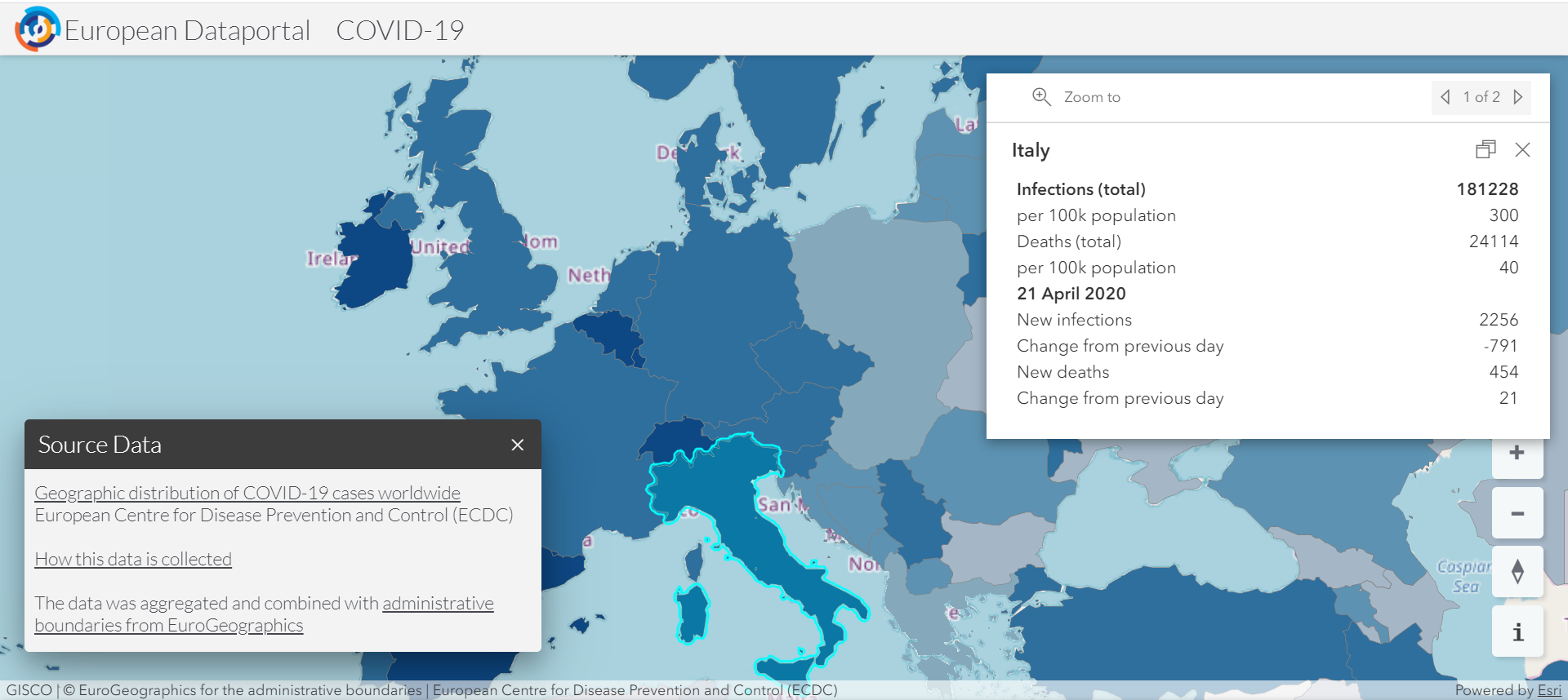
 Figure 1: EDP for COVID-19 visualisation (in collaboration with Con Terra) on the distribution of COVID-19 cases in Europe, retrieved on 22 April 2020.
ECDC’s COVID-19 dashboard
ECDC’s COVID-19-dedicated website consists of three dashboards: a global situation update, another one for the EU/EEA and the UK, and an interactive world map. The first two dashboards each consist of three parts; (1) a situation update on the number of cases and the number of deaths shown in tabular format, (2) the evolution of the distribution of confirmed cases per country shown in a histogram, and (3) the geographical distribution shown on a map. The third dashboard is an interactive map that offers a global overview where people can select whether they want global, European, or country-specific data, and for what time period they want to see the data. Figure 2 shows a screenshot of the interactive map for the EU/EEA and the UK.
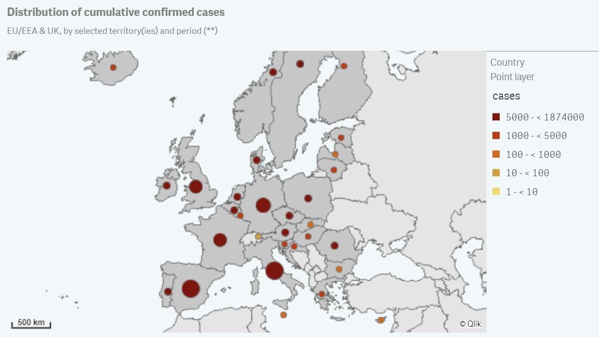
Figure 2: ECDC’s visualisation on the distribution of COVID-19 cases in EU/EEA and the UK, retrieved on 14 April 2020.
The ECDC set up an Epidemic Intelligence team to collect, screen and validate the data, that is updated daily and is based on reports from health authorities worldwide, such as ministries of health, the Early Warning and Response System (EWRS), the European Surveillance System (TESSy), and the WHO. Every day, between 06:00 and 10:00 CET, a team of epidemiologists screens all relevant sources from 196 countries to collect the latest figures. Every data entry is validated before they are documented in the ECDC database and published on the website. We appreciated how the ECDC website highlights how the published numbers might suffer from discrepancies due to the fact they are sourced from different institutions, with different methodologies and across different time zones, and need time to be validated properly. Use the numbers with caution and be aware of those limitations.
National COVID-19 dashboards in Europe
Many European countries also created a national dashboard. This provides them with the opportunity to go more into detail on the numbers within a country, such as county-, regional-, or city-specific numbers on cases, deceased, and hospitalised patients. A few examples, also found in the EDP for COVID-19 ‘Data Related Initiatives’ section are:
| Austria | Lithuania | ||
| Czech Republic | Malta | ||
| Denmark | The Netherlands | ||
| Estonia | Poland | ||
| Germany | Slovenia | ||
| Italy | Switzerland |
Together with the focus on their national territory, providing information in the countries’ own languages is an important value-added element of these services. For big parts of the population, being informed in their native language may be the only feasible option to get informed.
There are differences in how the dashboards have been set up. We will elaborate on three dashboards to provide a better understanding of different approaches.
Italy’s Civil Protection Department (Protezione Civile)
The dashboard of the Italian Civil Protection Department offers a one-page overview of the situation with all the recent figures describing the situation. The numbers are updated daily and are shown at different levels of granularity, at country-, region- and province-level. Figure 3 is a typical screenshot from the dashboard. The interactive map in the middle of the dashboard allows users to zoom in or out and to switch between regions and provinces to get a deeper understanding of the situation.
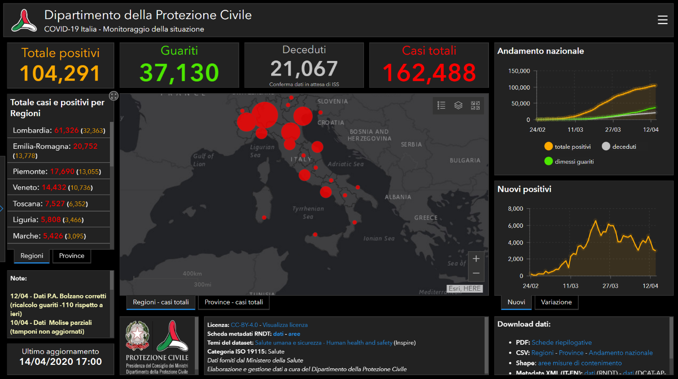
 Figure 3: Italian Dashboard created by the Italian Department of Civil Protection, retrieved on 15 April 2020.
Not only the data, but also the source code behind the dashboard can be downloaded, for the user to change and re-use freely, under a Creative Commons Attribution licence, and is provided by the Italian Ministry of Health.
Dutch Ministry of Health (Rijksinstituut voor Volksgezondheid en Milieu)
Some countries show a more basic overview of the numbers. For example, the Dutch dashboard is in the form of a standard website. It was created by the National Institute for Public Health and Environment (RIVM), which is part of the Dutch Ministry of Health, Well-Being and Sport. The page begins with numbers for the whole country and then makes a distinction between general numbers and numbers for health care workers. This is followed by a map of the Netherlands where the number of hospitalized patients per municipality can be found. This map is shown in figure 4.
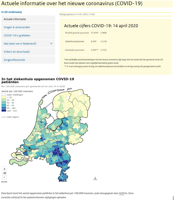
Figure 4: Recent information and country numbers on COVID-19 and a map of the Netherlands with number of hospitalised patients per 100.000 inhabitants © 2020 RIVM, retrieved on 15 April 2020.
The page has a different appearance as the more advanced dashboards, such as the ECDC’s and Italian dashboards, since this one mainly aims to update people on the most recent COVID-19 news and data. The Dutch dashboard has sections dedicated to FAQs, the measures taken by the government, people working in the healthcare sector, and common symptoms of the disease. The data is processed by the RIVM and provided by the Municipal Health Service (GGD).
Open Knowledge Estonia
Finally, the Estonian dashboard, created by Open Knowledge Estonia offers an alternative way to visualise COVID-19 related data. Its design is minimalistic and easy to read and interpret. First, the user can see a map displaying the absolute count of confirmed cases per 10.000 inhabitants per county, as shown in figure 5. The website also provides a deep dive into the numbers per day, per county, per gender, or per age category. An interesting feature of the dashboard is the chatbot, providing quickly answers to questions citizens might have about the dashboard or the Coronavirus in general.
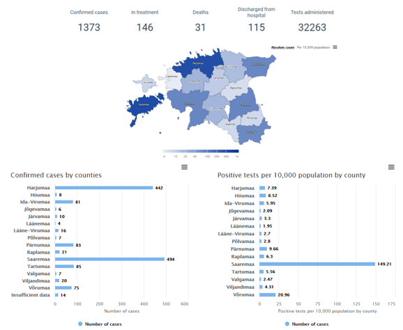
Figure 5: Bar charts and map of Estonia showing regional numbers on confirmed COVID-19 cases, retrieved on 15th of April 2020.
All data used by the website is updated on a daily basis and is provided by the Central Health Information System and Patient Portal (TEHIK). It is openly available and can be downloaded in several formats. Furthermore, the dashboard’s source code is provided as open source and users can propose additional features or develop them for themselves.
The four dashboards discussed demonstrate that there are various ways to visualise the data. Some dashboards are more innovative and make use of interactive maps or chatbots, while other dashboards use a regular website to display the numbers. Despite their differences, all the initiatives focus on similar aspects of the disease’s spread, such as number of cases, deceased or hospitalised patients. All dashboards provide country or world maps to visualise the phenomenon and quickly give an overview of the situation. A key point is that all dashboards are created for the same overarching purpose, that is informing the public on the COVID-19 situation in an easy and understandable way and to prevent misinformation.
Disclaimer
However, these dashboards are often accompanied by a disclaimer related to being cautious with interpreting the data. The convenience of visualisations makes the data easier to read and interpret but may also help users to draw conclusions on complex subjects such as the development of the COVID-19 pandemic that they may not have the necessary competence for. Dashboards are not a replacement for specialistic knowledge, and their simplicity of use may mislead the user into believing that the topic they represent is easy to understand, too. Interpreting whether, for example, the curve illustrating the number of infections is flattening within a country requires medical understanding of how epidemic and pandemics behave, knowledge of the context in which and methodology by which the data was collected and so on. Several aspects of a dashboard might also misrepresent the actual situation they are intended to illustrate, depending on the literacy of the user. For example: How much delay is there between the moment people were tested and when they are counted in the statistics? Is the number of people being tested presented in absolute terms or as a percentage of population? And is this number relevant for cross-border comparison, considering how dramatically the testing policy – or the availability of testing kits in the first place – can differ from one country to the other?
It is important to note that none of the dashboards listed in this article draws conclusions about the status of the epidemic, unless they can report statements by authoritative medical and research institutions. It is always necessary to use the data with caution and privilege the interpretation of experts such as the epidemiologists involved in fighting the emergency.
Looking for more open data related news? Visit the EDP news archive and follow us on Twitter, Facebook or LinkedIn.
